
The Hidden Language of Color in Film
Cinema is a tapestry woven from countless elements — dialogue, performance, cinematography, music, editing — all converging to evoke emotions and tell stories. But among these, one of the most subtle yet profoundly influential tools is color. Often working beneath the conscious awareness of the audience, color operates as a visual language, capable of conveying mood, foreshadowing events, sculpting character arcs, and immersing viewers into the narrative world.
Color theory in film is not simply about making scenes “look good.” It is about manipulating color strategically to enhance storytelling, stir emotional responses, and embed symbolic meaning. This article provides an exhaustive, in-depth exploration of how filmmakers deploy color theory as an indispensable narrative device.
We will journey through:
- The foundations of color theory and its psychological roots
- Emotional and symbolic meanings of common colors
- Case studies from iconic films where color shapes the narrative
- Genre-specific color palettes and visual codes
- How cinematographers, production designers, and colorists collaborate
- The evolving role of digital color grading and emerging trends
- Cultural nuances and challenges in global cinema
By the end, you’ll view your favorite films with new eyes, recognizing how every hue, tint, and shade serves a purpose in the story.
Foundations of Color Theory in Film
To grasp how color influences cinema, one must first understand the basics of color theory. Originating from art, design, and psychology, color theory provides a framework for understanding how colors interact, evoke emotions, and communicate meaning.
1. The Color Wheel: Visual Relationships
The color wheel, attributed to Isaac Newton, organizes colors into a spectrum of relationships:
- Primary Colors: Red, Blue, Yellow — from which all other colors derive
- Secondary Colors: Green, Orange, Purple — created by mixing primaries
- Tertiary Colors: Variations achieved by blending primary and secondary hues
Filmmakers often apply these relationships to build harmonious or contrasting color schemes, impacting visual cohesion and emotional tone.
2. Color Harmony and Contrast
Color harmony refers to combinations that are aesthetically pleasing and psychologically balanced. Common film palettes include:
- Complementary Colors: Opposites on the wheel (e.g., red/green, blue/orange) — create striking contrast, often used in action or sci-fi genres
- Analogous Colors: Adjacent hues (e.g., blue/teal/green) — evoke unity, seen in dream sequences or serene environments
- Monochromatic Schemes: Variations of a single hue — emphasize mood or psychological states
3. Warm vs. Cool Tones
Temperature is a fundamental tool in color theory film applications:
- Warm Colors (Red, Orange, Yellow): Stimulate energy, passion, danger, warmth
- Cool Colors (Blue, Green, Purple): Evoke calmness, isolation, melancholy, detachment
Temperature shifts can signal emotional changes, thematic contrasts, or spatial divisions within a film’s world.
4. Saturation and Value
- Saturation: Intensity or purity of a color — high saturation feels vivid and youthful; desaturated tones convey bleakness or nostalgia
- Value (Brightness): Lightness or darkness — high-value scenes feel airy and open; low-value scenes are moody, mysterious, or threatening
Cinematographers manipulate these aspects to match the emotional beats and narrative arcs of a film.
The Emotional and Symbolic Power of Color in Cinema

Colors carry deep psychological and cultural associations, often rooted in evolutionary or societal conditioning. Filmmakers tap into these associations to enrich storytelling, providing audiences with subconscious cues about characters, situations, or emotional states.
Here’s how common colors function in color theory film contexts:
| Color | Emotional and Symbolic Meanings | Iconic Film Example |
|---|---|---|
| Red | Passion, violence, urgency, power, love | Schindler’s List — The red coat |
| Blue | Sadness, calm, isolation, introspection | Moonlight — Emotional vulnerability |
| Green | Nature, envy, toxicity, the unnatural | The Matrix — Digital unreality |
| Yellow | Joy, decay, madness, sickness | Hereditary — Unsettling yellow palette |
| Purple | Royalty, mystery, eccentricity, transformation | Black Panther — Regal Wakandan hues |
| White | Purity, innocence, sterility, death (varies by culture) | 2001: A Space Odyssey — Futuristic minimalism |
| Black | Power, evil, formality, the unknown | The Dark Knight — Gotham’s underbelly |
These associations aren’t rigid — directors may subvert expectations, but they remain foundational in shaping audience responses.
Case Studies: When Color Drives Narrative
Let us now explore specific films where color theory in film is not simply a stylistic choice, but an integral element of storytelling.
1. Schindler’s List (1993) — Red Amid the Monochrome
Steven Spielberg’s haunting portrayal of the Holocaust uses stark black-and-white cinematography to mirror historical newsreel footage and heighten the film’s realism. Yet, amidst the desaturation, one element shatters the grayscale — a little girl’s red coat.
The red symbolizes innocence amidst genocide, standing as both a beacon of hope and a heartbreaking marker of vulnerability. Later, when Schindler sees the girl’s corpse, the emotional impact of that single color deepens. Spielberg uses red selectively, ensuring its appearance carries profound narrative weight.
2. The Grand Budapest Hotel (2014) — Pastel Nostalgia and Loss
Wes Anderson is renowned for meticulous visual symmetry and color precision. In The Grand Budapest Hotel, pastel pinks, lavenders, and corals dominate, constructing a whimsical, storybook world.
But beneath the charming palette lies thematic depth. The candy-colored environment evokes nostalgia for a bygone era, yet the encroaching presence of darker, militaristic hues signifies Europe’s descent into totalitarianism. The color shift mirrors the transition from innocence to historical tragedy.
3. Joker (2019) — Descent Through the Spectrum

Todd Phillips’ Joker charts Arthur Fleck’s transformation from a marginalized, mentally unstable man to the infamous Joker. The film’s color palette evolves alongside his descent.
- Early scenes employ muted, sickly greens and yellows, reflecting societal decay and Fleck’s deteriorating psyche.
- As Fleck embraces his chaotic identity, bold reds and purples dominate, symbolizing both power and anarchy.
The color progression visually narrates Arthur’s metamorphosis before his actions even unfold.
4. The Matrix (1999) — Green for the Machine
The Wachowskis use a subtle green tint throughout scenes set inside the Matrix, differentiating the simulated world from the real one.
- The sickly green filter references early computer screens, reinforcing the artificial, coded nature of the Matrix.
- In contrast, real-world scenes adopt cooler, blue-gray tones, signaling harsh authenticity.
This binary palette not only aids audience orientation but embeds a constant reminder of technological deception.
5. Moonlight (2016) — Blue as Identity and Love

Barry Jenkins crafts Moonlight as a visual poem, where color underscores themes of identity, longing, and vulnerability.
- Blue hues saturate pivotal moments, reflecting protagonist Chiron’s struggles with masculinity and acceptance.
- The recurring motif of “in moonlight, black boys look blue” fuses color with racial and personal identity.
The film’s intimate use of blue fosters emotional resonance, deepening the viewer’s connection to Chiron’s journey.
In these examples, color choices transcend aesthetics — they operate as narrative architecture, guiding interpretation and emotional investment.
Genre Palettes, Cultural Nuances, and Technical Mastery
Genre-Specific Color Codes
Filmmakers rely on established color conventions to signal genre and set audience expectations:
- Horror: Desaturated palettes, greenish filters, stark shadows (The Witch, The Babadook)
- Romance/Coming-of-Age: Warm, sunlit hues, naturalistic pastels (Call Me by Your Name, Lady Bird)
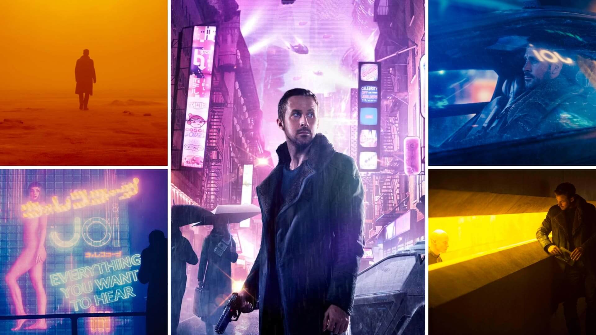
- Science Fiction: Sterile whites, metallic grays, neon blues (Ex Machina, Blade Runner 2049)
- Fantasy: Hyper-saturated colors, glowing effects, rich contrasts (The Lord of the Rings, The Shape of Water)
- Noir/Thriller: High contrast, low-key lighting, monochrome or muted schemes (Se7en, Chinatown)
By adhering to — or subverting — these conventions, directors manipulate genre familiarity to surprise or comfort viewers.
Cultural Considerations in Color
Color carries different meanings across cultures:
- White: Purity in Western weddings, mourning in East Asian funerals
- Red: Danger in Western thrillers, good fortune in Chinese tradition
- Yellow: Cheerful in some contexts, associated with sickness or deceit in others
Filmmakers crafting globally distributed films often walk a tightrope, balancing local color symbolism with universal resonance.
Technical Collaboration: Building a Cohesive Color World

Crafting a film’s color language is a multidisciplinary effort involving:
- Cinematographers: Lighting and lens choices establish color temperature and tonal range
- Production Designers: Sets, props, and wardrobe reflect consistent palette control
- Colorists: In post-production, hue, saturation, and contrast are digitally refined to unify visual style
Example: In Blade Runner 2049, Roger Deakins’ cinematography and Dennis Gassner’s production design coordinate color-coded environments:
- Orange wastelands: Signal entropy and ecological collapse
- Blue cityscapes: Evoke cold urban detachment
Such cohesion ensures every frame reinforces mood, theme, and narrative progression.
Digital Color Grading, AI, and the Future of Cinematic Color
The Rise of Digital Color Grading
In the digital era, color correction has evolved beyond chemical processing into sophisticated digital color grading. Tools like DaVinci Resolve allow unprecedented precision:
- Adjust hue, saturation, and luminance independently
- Isolate regions of the frame for selective grading
- Match color tones across complex, multi-location shoots
- Create distinct “looks” that reinforce mood and theme
Modern films leverage color grading to:
- Evoke period aesthetics (O Brother, Where Art Thou? pioneered digital sepia tones)
- Build hyper-stylized worlds (Mad Max: Fury Road with saturated oranges and teals)
- Create seamless continuity across digital VFX sequences
AI and Machine Learning in Color Workflows
Artificial Intelligence is reshaping post-production:
- Automated Color Matching: AI can replicate “look books” or reference films rapidly
- Scene Recognition: Algorithms analyze narrative context to suggest color palettes
- Real-time LUT Generation: AI tools create custom “Looks” during live on-set monitoring
Example: Netflix productions increasingly utilize AI to standardize color quality across diverse global teams, ensuring visual consistency.
While AI enhances efficiency, human artistic intent remains central to meaningful color storytelling.
Emerging Trends in Color Storytelling
As audiences grow visually literate, filmmakers push boundaries:
- Color as Unreliable Narrative: Films like Midsommar use brightness to disorient rather than comfort
- Hyperreal Palettes: Music videos and experimental films embrace neon saturation and surreal gradients
- Interactive Color: VR and AR experiences let users “move through” evolving color environments
- Cultural Color Hybrids: Global streaming fosters fusion aesthetics, blending regional palettes with Hollywood sensibilities
The future of color theory in film lies in this balance — technology empowers innovation, but at its core, color remains an emotional language.
In conclusion, from silent era tinting to today’s algorithm-driven grading, color has remained one of cinema’s most potent storytelling tools. Masterful filmmakers leverage hue, contrast, and saturation not merely to dazzle the eye, but to etch meaning, mood, and memory onto every frame.
Color — The Silent Storyteller of Cinema

Color in film is far more than aesthetic flourish — it is a silent storyteller, subtly guiding viewers through emotional terrain, narrative shifts, and thematic undercurrents. As we have explored, directors and cinematographers meticulously employ color theory to:
- Elicit subconscious emotional responses
- Shape character perception and development
- Reinforce genre conventions or subvert expectations
- Establish visual continuity and world-building
- Embed symbolic meaning beyond dialogue or plot
From Spielberg’s selective use of red in Schindler’s List to the neon-drenched dystopias of Blade Runner 2049, color operates as a powerful cinematic language. It communicates where words cannot, infusing frames with atmosphere, tension, longing, or dread.
In the age of digital color grading and AI-assisted workflows, filmmakers possess unprecedented tools to manipulate color with surgical precision. Yet, the heart of effective color storytelling remains unchanged — an understanding of how hues influence human emotion, cultural meaning, and visual rhythm.
For cinephiles, recognizing color theory in film enhances appreciation, deepening engagement with both the visual and emotional architecture of cinema. For filmmakers, mastering color is essential — because beyond scripts and performances, it is color that often leaves the most indelible mark on the viewer’s memory.
In the end, color doesn’t simply decorate film — it shapes its very soul.
Color theory film applications will only grow more nuanced, making color literacy an essential skill — for filmmakers and cinephiles alike.


