
Introduction: Why Data Visualization Matters in the Fight for Social Good
In a world saturated with information, data visualization has emerged as a powerful tool for driving social impact. From climate change awareness to racial justice campaigns, visualizing data makes complex stories accessible, compelling, and unforgettable. It’s more than just aesthetics; it’s about clarity, transparency, and emotional resonance. When used ethically, data storytelling can galvanize movements, inform policy, and hold institutions accountable.
As more nonprofits, activists, and social enterprises turn to visual tools, understanding how to use data visualization effectively is not just a skill; it’s a civic responsibility.
The Power of Data Storytelling
What Is Data Visualization for Social Impact?
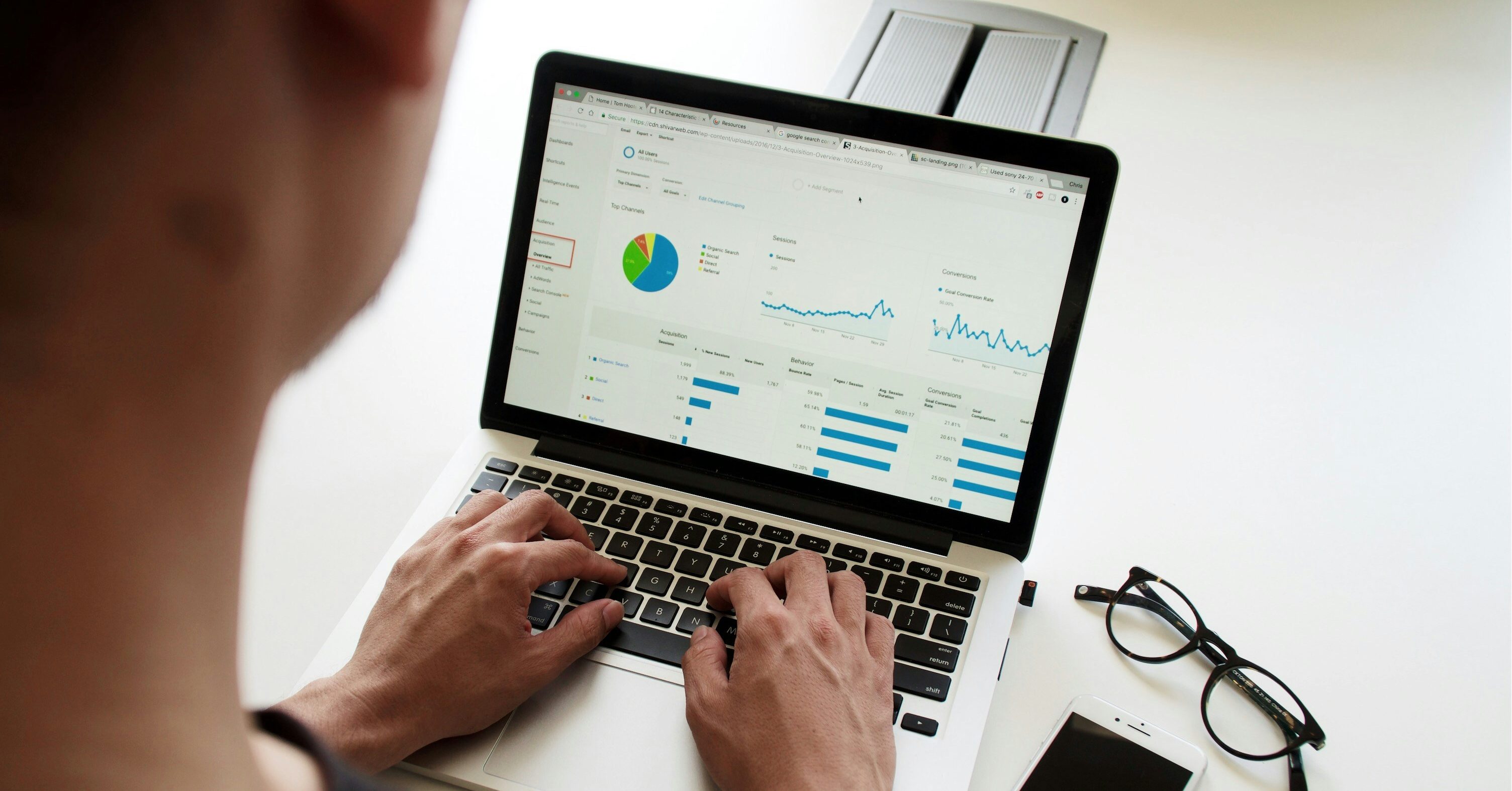
Data visualization is the graphical representation of information and data. In the realm of social good, it helps transform raw statistics into intuitive visual formats, such as charts, graphs, maps, infographics, dashboards, and interactive tools, enabling stakeholders to see patterns and act on them quickly.
Why It Works
- Simplifies Complexity: Graphs and infographics distill complex datasets into digestible insights.
- Elicits Emotion: Visuals can humanize statistics, sparking empathy and urgency.
- Builds Trust: Transparent data builds credibility and trust with audiences.
- Influences Decision-Makers: Policymakers are more likely to act when data is both persuasive and clear.
Real-World Example:
The Gun Violence Archive uses interactive maps and charts to track every gun-related incident in the U.S. By turning numbers into visual patterns, the site helps the public and lawmakers grasp the scale of the crisis.

Ethical Considerations in Data Visualization
While data visualization is powerful, it carries ethical responsibilities. Misleading visuals can distort the truth and reinforce harmful narratives.
Key Ethical Guidelines:
- Accuracy Above All: Never manipulate axes or scales to exaggerate trends.
- Context Matters: Avoid cherry-picking data. Show the full picture.
- Representation Equity: Use inclusive design that avoids stigmatizing communities.
- Source Transparency: Always cite your data sources.
- Consent and Privacy: Protect personal data in visualizations involving sensitive subjects.
Case Study:
During the COVID-19 pandemic, dashboards like Johns Hopkins University’s COVID-19 Tracker became global tools. Its clear, up-to-date, and responsibly sourced visuals were a model for ethical data use.
Tools of the Trade — Platforms for Social Impact Visualizations
Creating impactful visuals doesn’t require a degree in data science. A host of free and paid tools can help social impact storytellers create polished, engaging graphics.
1. Tableau Public
- Use Case: Interactive dashboards for NGOs
- Pros: Powerful analytics, dynamic visualizations
- Cons: Learning curve for beginners
- Example: Tableau dashboards by UNICEF illustrate progress on child nutrition across regions.
2. Flourish
- Use Case: Animated charts and storytelling formats
- Pros: Easy to embed and customize; no coding required
- Example: Amnesty International uses Flourish to show human rights violations by country.
3. Datawrapper
- Use Case: Static or interactive charts, maps, and tables
- Pros: Quick setup, intuitive UI
- Cons: Limited design flexibility
- Example: ProPublica often uses Datawrapper to share investigative data clearly and cleanly.
4. Mapbox
- Use Case: Location-based advocacy or disaster response
- Pros: Advanced mapping with customization
- Cons: More technical knowledge required
- Example: Human Rights Watch maps conflict zones to expose violations.
5. RAWGraphs
- Use Case: Complex data relationships (like network diagrams or flow maps)
- Pros: Open-source, highly customizable
- Cons: Best for designers familiar with datasets
- Example: Visualizing migration routes or interconnections in global supply chains.
Crafting the Narrative — From Data to Impactful Stories
1. Know Your Audience
Not every audience is data literate. Tailor your visuals accordingly:
- For policymakers: clear bar graphs with actionable insights
- For the public: infographics with minimal jargon
- For academics: detailed dashboards with filters and footnotes
2. Define a Clear Narrative Arc
Great data storytelling follows a narrative structure:
- Setup: What’s the issue?
- Conflict: What does the data reveal?
- Resolution: What needs to change and how?
3. Combine Quantitative with Qualitative
Pair stats with personal stories. A chart showing rising eviction rates becomes far more powerful when accompanied by a quote from a displaced tenant.
4. Prioritize Accessibility
Ensure your visuals are:
- Colorblind-friendly
- Screen-reader compatible
- Mobile-responsive
Tip: Tools like ColorBrewer help choose accessible color palettes.
Case Studies of Impact
1. The Marshall Project: Criminal Justice Data
This nonprofit journalism platform uses data visualization to expose systemic injustices in U.S. prisons. Their interactive pieces, like “The Next to Die” (tracking scheduled executions), mix data with human stories.
2. Global Forest Watch
Powered by satellite data and Mapbox visualizations, this tool monitors deforestation in real-time. It empowers local communities, governments, and NGOs to combat illegal logging with evidence-based action.
3. Information is Beautiful
While not solely focused on social good, this platform visualizes global challenges (e.g., gender inequality, vaccination misinformation) in engaging, shareable formats.
4. Black Lives Matter Data Projects
Following the George Floyd protests, projects like Mapping Police Violence used accessible dashboards to spotlight racial disparities in law enforcement killings.
Challenges and How to Overcome Them
1. Data Gaps
- Problem: Many marginalized communities are underrepresented in datasets.
- Solution: Combine official data with community-collected statistics (e.g., participatory mapping).
2. Limited Resources
- Problem: Small organizations may lack tech teams or design expertise.
- Solution: Use free tools and templates; collaborate with pro-bono designers or universities.
3. Misinterpretation
- Problem: Audiences may misunderstand visuals.
- Solution: Include clear titles, legends, and annotations. Test visuals with users before publishing.
Data Journalism Meets Activism

Today, the line between journalism and activism is blurring. Data-driven content is fueling digital advocacy campaigns, policy briefings, and fundraising efforts.
Social Impact Areas Where Data Visualization Is Driving Change:
- Climate Justice: Global warming maps, carbon emission graphs
- Public Health: Vaccine coverage dashboards, disease spread simulations
- Education Inequality: School funding comparisons, dropout rates
- Gender Equity: Wage gap charts, representation heatmaps
- Refugee Crises: Migration flows, displacement statistics
These visualizations don’t just inform—they mobilize.
The Future of Data for Good
As AI, satellite imagery, and real-time sensors evolve, the possibilities for socially impactful data storytelling are expanding. Yet with great power comes the need for stronger safeguards around data ethics, consent, and privacy.
Emerging Trends:
- AI-Assisted Visualization: Platforms like ChartGPT or Voyager suggest visual formats automatically.
- Real-Time Dashboards: COVID-19 has made real-time data a public expectation.
- Crowdsourced Mapping: Initiatives like Ushahidi use citizen reports to map crisis areas.
The future of social change will be as much about how we visualize problems as how we solve them.
Conclusion: A Call to Visual Action
In the battle for attention and action, data visualization is your strongest ally. When used responsibly, it gives the silent a voice, the invisible a spotlight, and the overlooked a platform. Whether you’re a nonprofit, activist, journalist, or concerned citizen, learning how to use visual data effectively isn’t just a career skill; it’s a tool for change.
Don’t just inform. Inspire.
References
Stanford Social Innovation Review – Data Visualization for Social Change
https://ssir.org/articles/entry/data_visualization_for_social_change
Datawrapper Academy – Ethical Charts Guide
https://blog.datawrapper.de/ethicalcharts/
UNICEF Data Hub
https://data.unicef.org/
Visualizing Impact – Data-Driven Tools for Social Justice
https://visualizingimpact.org/
Open Data for Development (OD4D)
https://od4d.net/
ColorBrewer – Color Advice for Maps
https://colorbrewer2.org/
Global Forest Watch – Monitor Forests in Near Real Time
https://www.globalforestwatch.org/
Mapping Police Violence – Data Tracking Police Killings Nationwide
https://mappingpoliceviolence.org/
The Marshall Project – Journalism About Criminal Justice
https://www.themarshallproject.org/
Flourish Studio – Create Stunning Data Visualizations
https://flourish.studio/
Tableau Public – Free Data Visualization Platform
https://public.tableau.com/
Gun Violence Archive – Real-Time Gun Incident Reports
https://www.gunviolencearchive.org/
Olivia Santoro is a writer and communications creative focused on media, digital culture, and social impact, particularly where communication intersects with society. She’s passionate about exploring how technology, storytelling, and social platforms shape public perception and drive meaningful change. Olivia also writes on sustainability in fashion, emerging trends in entertainment, and stories that reflect Gen Z voices in today’s fast-changing world.
Connect with her here: https://www.linkedin.com/in/olivia-santoro-1b1b02255/


